Geoscience Illustration and Animation
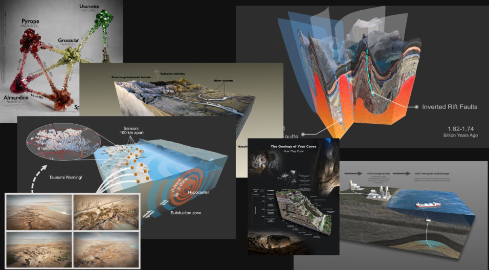
Geological Illustrations
Clear and accurate visuals communicate complex technologies and processes with clarity, boost presentations, reports and pitch decks, strengthen research impact and support education and science communication. It helps:
- Researchers communicate their findings effectively
- Companies present innovations with clarity and confidence
- Public audiences quickly grasp complex Earth processes
View GEO Gallery
Geological Animations
Some processes can’t be fully captured in a single image – this is where animation becomes essential.
Geoscience animation allows dynamic systems to unfold over time: tectonic movement, sediment transport, volcanic activity, groundwater flow… Animation reveals processes, change, and cause-and-effect relationships. It is powerful tool for communicating processes that are:
- Invisible (subsurface or microscopic)
- Slow (geological timescales)
- Complex (multi-step systems and interactions)
View GEO Gallery
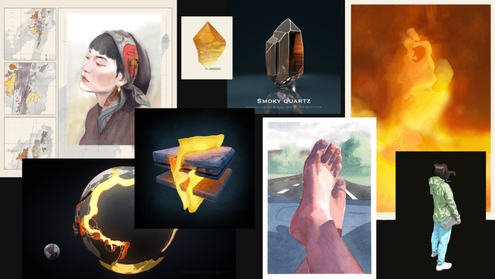
Artwork
My artwork is inspired by geoscience, natural world and my surroundings, faces, forms, textures, and patterns that I notice, or simply a new tube of watercolor paint that I feel urgency to experiment with. Unlike scientific illustration, these pieces are not bound by strict accuracy, allowing for a more creative and expressive approach.
View GEO Gallery and ART Gallery
About
Lina Jakaitė-Darkšė
Hi! I am a geologist by education. I worked as one for about a decade in a few companies. And drawing was my after-work hobby. Through my work as a geologist, I gained experience with various geological and GIS-based software, and through my artistic practice, I developed skills in art and design. At some point I decided to combine these two paths and become a geoscience illustrator.
Professional geological background gives me a strong understanding of geological processes, data and terminology – allowing me to quickly grasp your geological ideas and translate them accurately into visualizations. I work with universities and research institutions, museums, environmental, energy, mining and geoscience companies.
So if you think I’m a good fit for your project or simply have questions – do not hesitate and contact me. But if you are still unsure about contacting me – check FAQ – you might find some answers about the typical visualization process.