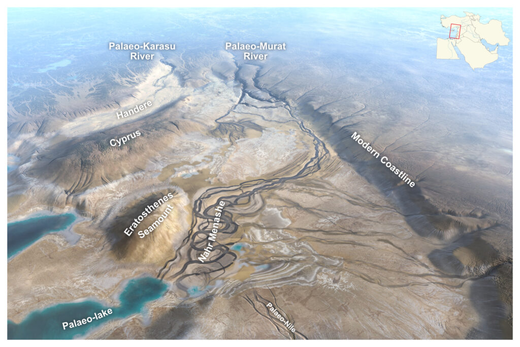
Late Miocene Euphrates River drained into Mediteranean
The article with my illustration appeared in Nature Geoscience! More than 2 years passed since I worked with the authors of this study, helping them to illustrate their view, interpretation and understanding of this paleoenvironment.
The illustration is very well thought out. I imagine many of us, internet scrollers, might accidentally land on this illustration and assume it’s just an artistic rendition inspired by some study… At least I would, I think… if I saw something like this :)) No. All the elements are data and interpretation based.
Of course, the image had to be stylized and exaggerated, as we obviously can not know exact details on many aspects, and making it as a ‘realistic photo of the area’ would be just a flat ‘satellite’ photo.
However, various geomorphological elements are very much intentional. Notice elements like deserted area above Cyprus at Handere with multiple tiny fluvial channels or deep incised valleys at the beginning of Nahr Menashe, or delta at the end of one of those valleys, different degree of river sinuosity, layered evaporites, lake… And there are even yardangs! Can you spot them?
In order to make this illustration, I received paleoelevations, polygons for different facies, and references to the present day facies examples. So the entire area that you see in this illustration would be covered in maaaaany different polygons-facies. I used present-day analogs as a reference for one or another aspect, like reference for color, maybe shape, river meandering, etc. Here are some: Neals River (Australia), Okavango Delta (Botswana), Barcoo River (Australia), Hamun-e Jaz Murian (Iran), Thomson River (Australia), Dead Sea, Aral Sea, Daak Nushki Desert (Pakistan), Lut Desert (China), Rakaia River (New Zealand)… I challenge you to check those analogs and find what elements and where in the illustration were inspired by them!
By the way, the central idea of the article is very interesting! But I don’t want to spoil it for you, so I won’t tell it, I’ll just leave the title of the article: Late Miocene Euphrates River drained into a partially desiccated eastern Mediterranean. :))
Have a nice reading and analyzing what is what in this illustration! https://www.nature.com/articles/s41561-026-01962-x
Paleoenvironments Offshore the Netherlands
Did you know??? Back in the Ice Age, you could actually walk from France to the UK!
Geologists know this well, but if you’re not one of the geo folks, it might be something new to learn: when specialists such as sedimentologists or paleoenvironments researchers look at gravel, sand or clay, they don’t just see raw material itself – they „see” much more: ancient rivers, lakes, or vast glaciers – environments where those sediments were formed.
A wide range of geological, geotechnical, and seismic studies are usually done for offshore wind farms. The main focus of such studies is, of course, geotechnical aspects of the seabed and subsurface. However, depositional environments and transport processes, thus paleoenvironments are greatly responsible for physical properties and areal distribution of the soils, so understanding paleoenvironments is of significant importance. Nevertheless, comprehensive paleo studies rarely appear in technical reports.
In an unusual and refreshing step, Norwegian Geotechnical Institute (NGI) decided to highlight and share this often underappreciated part of the extensive technical studies.
I had a pleasure of illustrating and animating this paleo-story shown in animation. The animation shows how the environment of one particular spot in today’s North Sea has changed over the past 500,000 years – based on real and detailed research (https://offshorewind.rvo.nl/page/view/2dd28a50-5344-47a6-b3ff-7d0e36911159/soil-ijmuiden-ver).
And as always, I simply animated and illustrated it, but I could do nothing without NGI’s team, their knowledge and guidance.
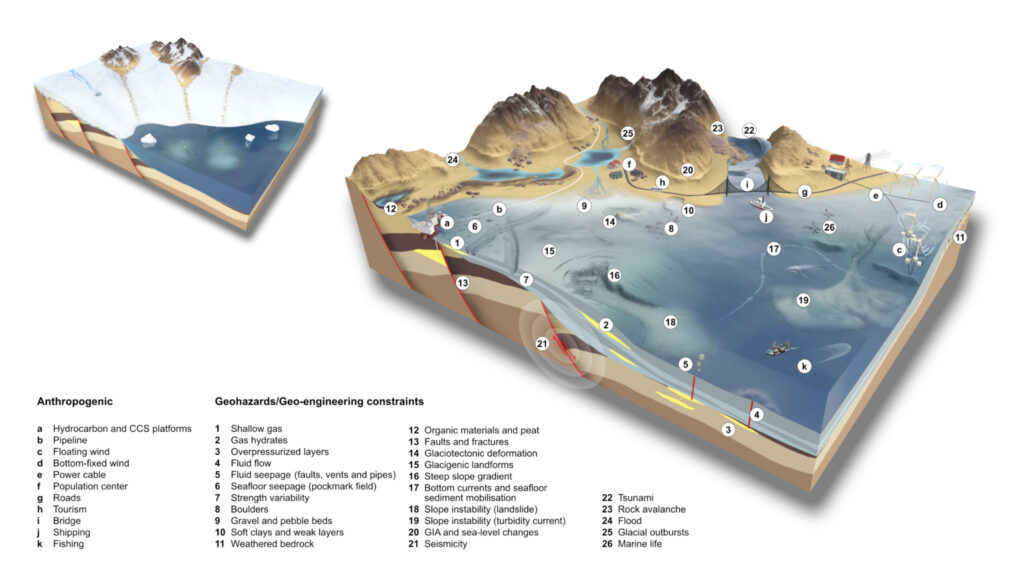
Geohazards and geo-engineering constraints
This particular illustration, showing geohazards and geo-engineering constraints along the glaciated European margins, was created for NGI and their article. Preprint of the article is available here: https://eartharxiv.org/repository/view/9135/
Creating this illustration was a bit like a puzzle solving for me, as I had to fit many elements in it and still keep a geological-geomorphological logic. And in order not to overcomplicate it more, I chose simple, plain and clean colors and textures. In the end I feel that I not only created an illustration for an article but made an educational tool for myself :))
Magnetic signals from ocean tides
I’m on the journal cover! OK, not me exactly, but my illustration :))
Philosophical Transactions of the Royal Society. Vol. 382, Issue 2286
Honestly, I didn’t contribute any scientific insights to the article the illustration is associated with – I simply helped the authors present their study in a more visually engaging way. That said, the task wasn’t easy and straightforward. The illustration is built on real data, and authors, as always, challenged me with complex datasets as the foundation. Those colourful little arrows? They’re actual vector data – just reduced and ‘polished’ for visual simplicity purpose.
The article explores how the movement of ocean tides interacts with Earth’s magnetic field to create faint magnetic signals. Using satellite data, these signals can be used to uncover details about the ocean floor and Earth’s mantle, providing valuable insights into both Earth’s interior and potential ocean changes over time.
Being a geologist I do get the main idea of the article, but I have to admit that I lack a deep understanding of the math and physics behind this study, so I wouldn’t dare to explain article’s deeper details here for you. If you’re curious about the essence of the research, it’s best to refer directly to one of the authors, Alexander Grayver´s, recent post here on LinkedIn: https://lnkd.in/e8RvRgdS
It has links to the article itself and few other, like ESA Swarm mission, which you might find interesting as well.
By the way, you’ll find a breakdown of this illustration on Alexander’s post.
It’s exciting, and I suppose it’s a small achievement to be proud of 🤭
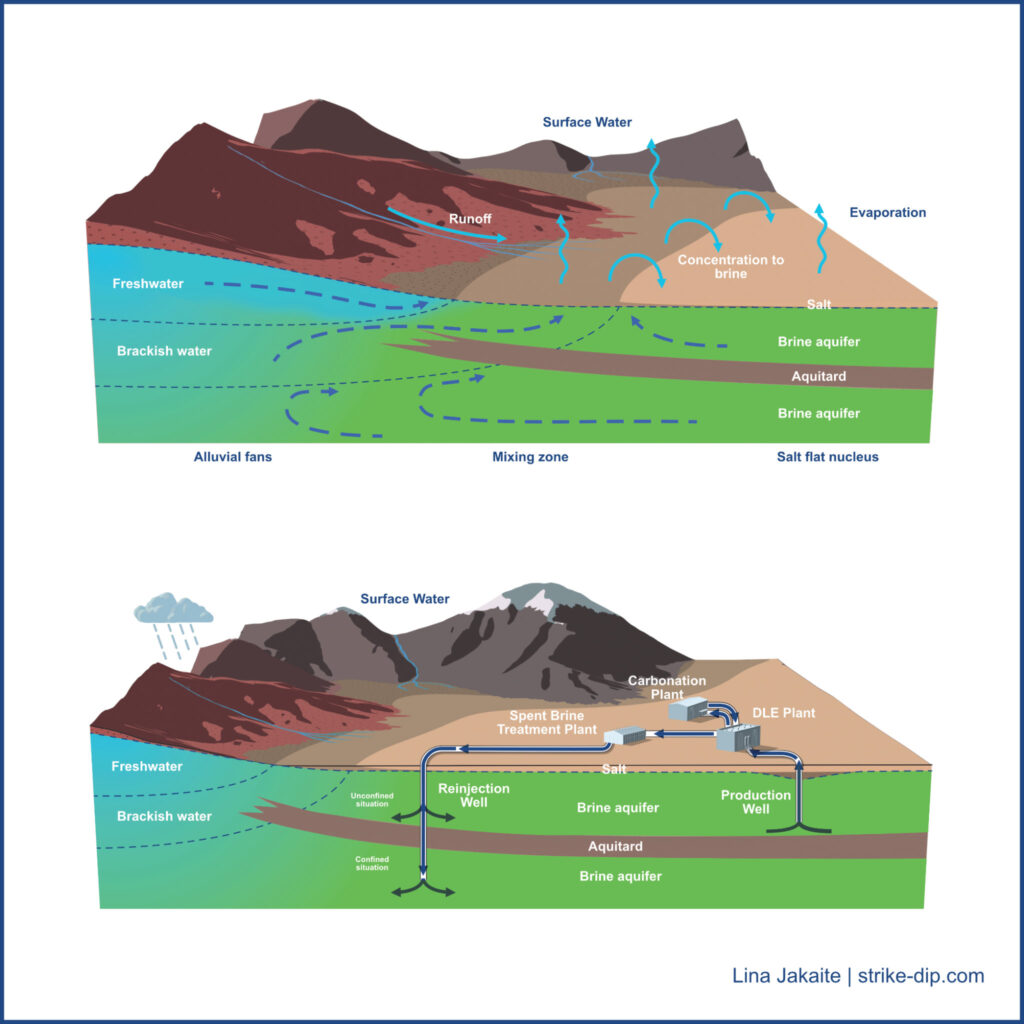
Salar hydrogeology
In a recent years I had a few projects where I illustrated lithium brine related topics. These here are just a couple of illustrations from a bigger collection done for Zelandez company. Those pictures slightly differ from my usual art style but I love how they turned out! Truth to be told, I personally really like this simplistic style, even though it is not so obvious when looking at my published works :))
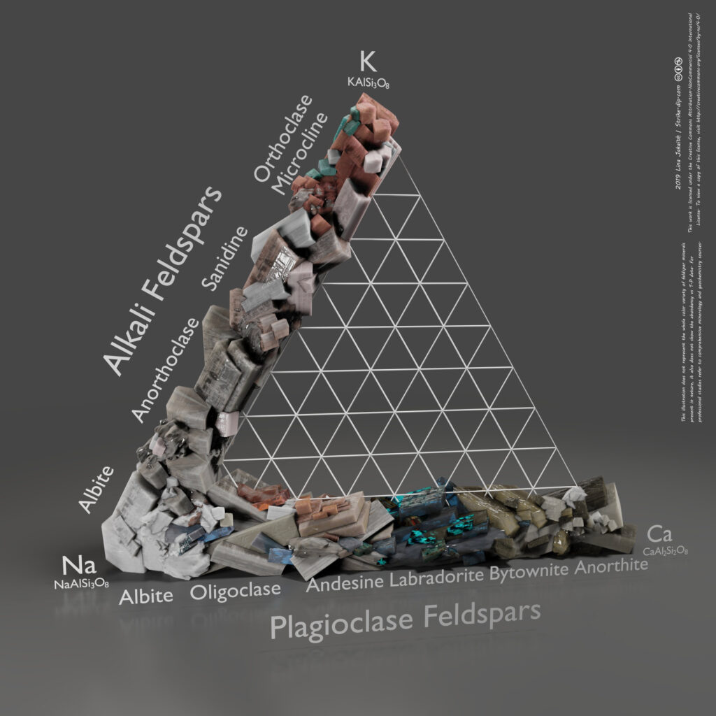
Feldspars
Feldspars are one of the most common minerals on Earth. There are two solid solution series of feldspar minerals: alkali feldspars and plagioclase feldspars. The end members of these solid solutions are potassium feldspar (orthoclase, microcline) (KAlSi3O8) – albite (NaAlSi3O8) – anorthite (CaAl2Si2O8). So, the alkali felspars range from orthoclase and microcline to albite. Accordingly, chemical formula of these minerals ranges from KAlSi3O8 to NaAlSi3O8 because of K+-Na+ substitution. Ion charge is the same. However, the ion size is not that similar so that K+ and Na+ would change each other very easy, that is why at lower temperatures there is a gap in alkali feldspar sequence. But in higher temperatures this substitution happens and then there is no gap in alkali sequence. This aspect is not illustrated in my picture.
Plagioclase feldspars range from albite to anorthite, so from NaAlSi3O8 to CaAl2Si2O8 because of Na+Si4+– Ca2+Al3+ substitution. Na+ and Ca2+ ions are similar in size, so they tend to substitute each other, and the difference in charge is compensated by Si4+ and Al3+.
The solid solution between K and Ca feldspars doesn’t work because of both ion sizes and charges differences. K+ and Ca2+ differ in ion size and charge and Si with Al cannot compensate those differences.
Intermediate blended minerals are present for both sequences. Barium feldspars (celsian and hyalophane) are not illustrated there.
This illustration is simplified and generalized version of feldspar mineral classification. It is important to know that some feldspars form in high temperature (ex. sanidine) whereas others in low (ex. microcline). Meanwhile this picture generalizes all feldspars and does not tell anything about mineral abundance depending on t-p conditions.
Colors of feldspar minerals have great variety and this illustration can not show all the possible variety. However, few, more common colors are used for each mineral. The ‘colorless’ color is ignored there.
Again, this picture is not for professional mineralogy use but can be used by professionals as fun illustration to put on the wall, show non-geologist friend or explain basics to the beginners.
High resolution poster available there:https://gumroad.com/linajakaite
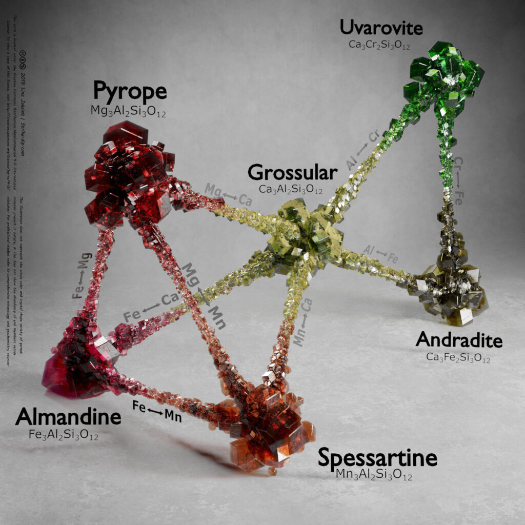
Garnets
Garnet minerals are great group of silicate minerals with general chemical formula X3Y2Si3O12. X stands for divalent Ca, Mg, Fe and Mn cations and Y – for trivalent Al, Fe and Cr cations. There are two main groups of garnet minerals. One group is Uvarovite (Ca3Cr2Si3O12) – Grossular (Ca3Al2Si3O12) – Andradite (Ca3Fe2Si3O12) group. This group is called Ugrandite (based on the beginnings of garnet minerals names within this group). This group has calcium in X position and chromium, aluminum or iron in Y position. Uvarovite, Grossular and Andradite are end members of this group, but mixed compositions (example: Ca3(Al, Fe)Si3O12) are also common.
Another group: Pyrope (Mg3Al2Si3O12) – Almandine (Fe3Al2Si3O12) – Spessartine (Mn3Al2Si3O12). This group is called Pyralspite group. This group has aluminum in Y position and magnesium, iron or manganese in X position. All these three minerals can also blend with each other and form mixed minerals. Also, minerals of this group can blend to Grossular through calcium – magnesium, iron or manganese cations exchange.
This illustration shows those relations. At the peaks there are end members shown and those end members which blend to each other are connected. The amount of minerals at the end parts and at the mixture parts does not represent any mineral abundancy data. The enhancement at the peaks is just for illustration purpose.
I’ve chose one color for each garnet mineral. I’ve used more common color for each garnet, but it is important to note that garnet mineral colors have greater variety. And some garnets in its pure form is even colorless.
I’ve also used only one mineral crystal shape when there are more.
This scheme is not suited for professional studies. Other, more comprehensive mineralogy or geochemistry sources should be used if one studies garnet minerals professionally. This scheme is useful for geology or mineralogy beginners, enthusiasts or even for professional geologists as science-based eye appealing and fun illustration.
If you want high resolution poster, you can get it there: https://gumroad.com/linajakaite
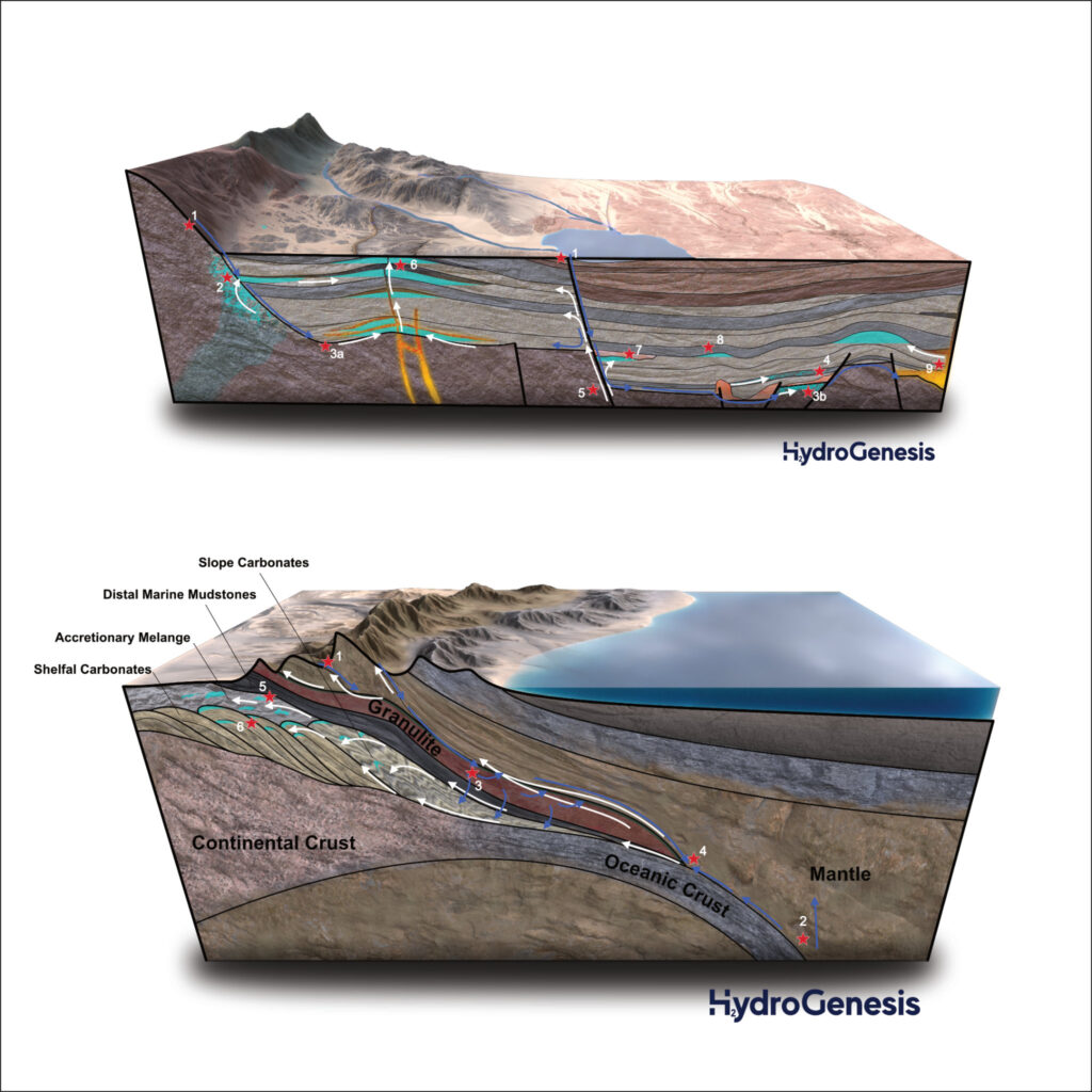
Hydrogen
Natural hydrogen generation in intracratonic basin and ophiolites – a couple of illustration done for HydroGenesis. Captions for both illustrations as well as the full article can be found there: https://geoexpro.com/the-genesis-of-natural-hydrogen-exploration/
Tectonic Plates
It is fun and relatively easy to do animations like this one. Once you have all the data. I had it already prepared because I used it for some of my previous projects. So I just had some fun playing with colors and textures while making this animation.
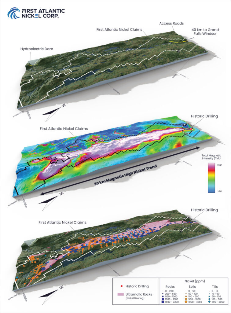
Atlantic Nickel Project
3D representation of a geological and geophysical data of Atlantic Nickel Project, Newfoundland, Canada.
Done for First Atlantic Nickel Corp. More info about the project itself on their website: https://www.fanickel.com/atlantic
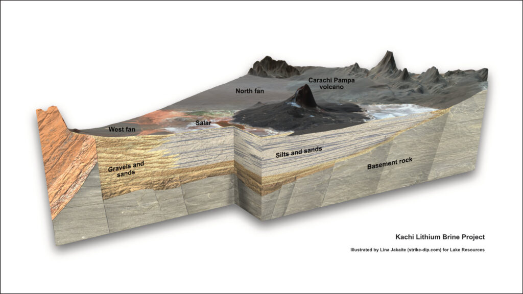
Kachi Project
Made some illustrations for Lake Resources on Kachi project. One of them is this 3D block diagram.
More info about the project can be found there: https://lakeresources.com.au/wp-content/uploads/2023/12/lke_kachi-dfs_19-dec-23.pdf
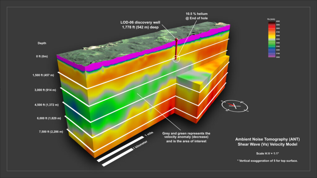
Ambient Noise Tomography
Ambient Noise Tomography Shear Wave model and depth slice illustrations done for Pulsar Helium.
Much of my work I publish is very much to the artistic side. However, in many cases they are based on real data. In this case the illustrations ARE the data.
Making illustrations like these brings me back to time when I was more of a geologist than illustrator :))
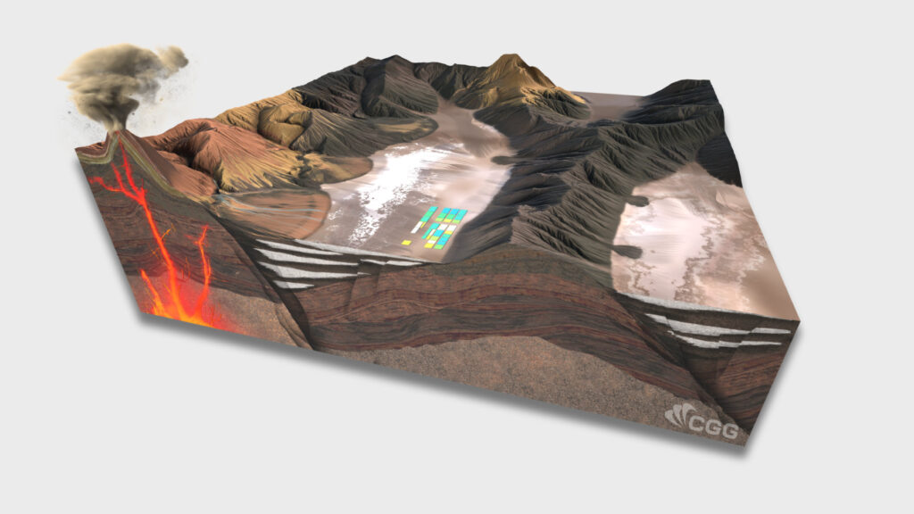
Offshore Geothermal
Image created for CGG’s white paper ‘Offshore Geothermal: A Green Energy Resource of Global Significance and its Responsible Development’ (https://www.cgg.com/sites/default/files/2024-02/CGG_ISA_Offshore_Geothermal_White_Paper_2024.pdf)
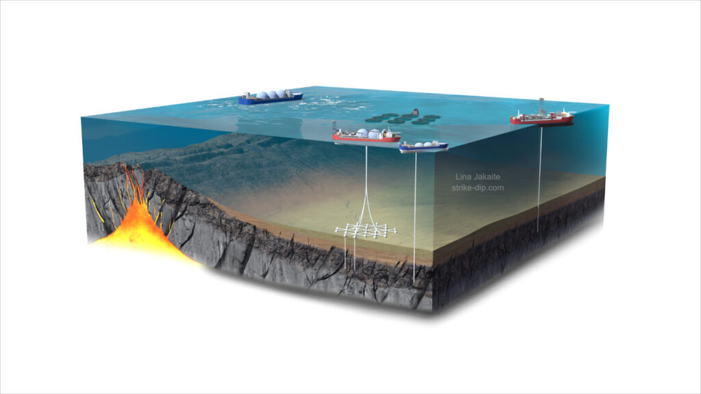
Lithium brine system
Lithium is quite a common topic in my illustrations recently. They often contain really beautiful geology, terrains and colors, like red-orange-brown-black mountains and volcanoes surrounding lakes and salars which are contrasting with white and pastel palette.
I’ve done this one for the CGG team to help illustrate their study. This illustration is just a little visual piece done for their further use in the poster.
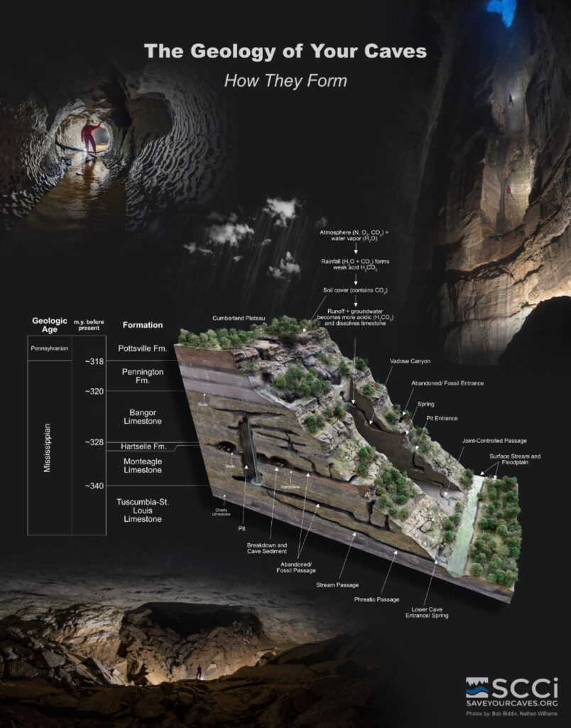
Geology of Caves. How they form
Karst geology poster created for Southeastern Cave Conservancy (SCCi) (https://www.saveyourcaves.org/)
It illustrates cave formation processes and cave forms. Its not only a great education tool or decoration for your home but also a chance to support SCCi by purchasing this poster at their store: https://southeastern-cave-conservancy-inc.square.site/product/cave-geology-poster/155?cs=true&cst=custom
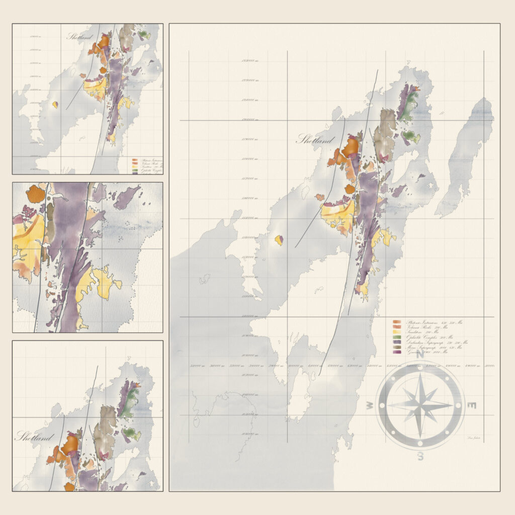
Shetland Islands Geology in watercolor
Painting geological maps in watercolor works as a coloring book for me – relaxes the mind. There is no specific reason why I choose one or another part of the world, I just find something interesting, shape, shoreline, bathymetry, geology, etc.
Geology shown there is a combination and simplification based on few online resources, therefore it obviously might be inaccurate in some places. But since the aim of this image is to be an artwork and not an actual map – all good, I guess :))
The whole map is quite big, so details are not visible on screen. Therefore, to highlight the texture of paper and watercolor I added few parts zoomed and cropped.
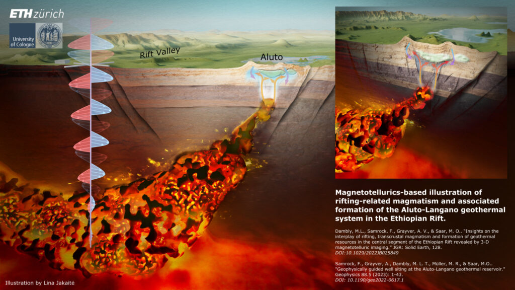
Aluto volcano’s Subsurface structure, Ethiopian Rift
This illustration portrays the significant subsurface structures beneath Ethiopia’s Aluto volcano, providing valuable insights into its deep-rooted magmatic plumbing system and the shallow magmatic system responsible for heating its volcano-hosted geothermal system.
The authors of the study (articles: https://library.seg.org/doi/10.1190/geo2022-0617.1 and https://agupubs.onlinelibrary.wiley.com/doi/10.1029/2022JB025849) used the geophysical imaging technique called magnetotellurics to unravel the subsurface architecture of the Aluto-Langano geothermal field in the Main Ethiopian Rift – home to the only operating geothermal power plant in Ethiopia. The study demonstrates the immense value of the magnetotelluric method for volcano imaging and for understanding magma-driven geothermal systems.
The foundation of the illustration was actual 3D data provided by the study authors, therefore you can recognize that main features, like the shape of the magma body shown in the illustration corresponds to the 3D models represented in the publications mentioned above.
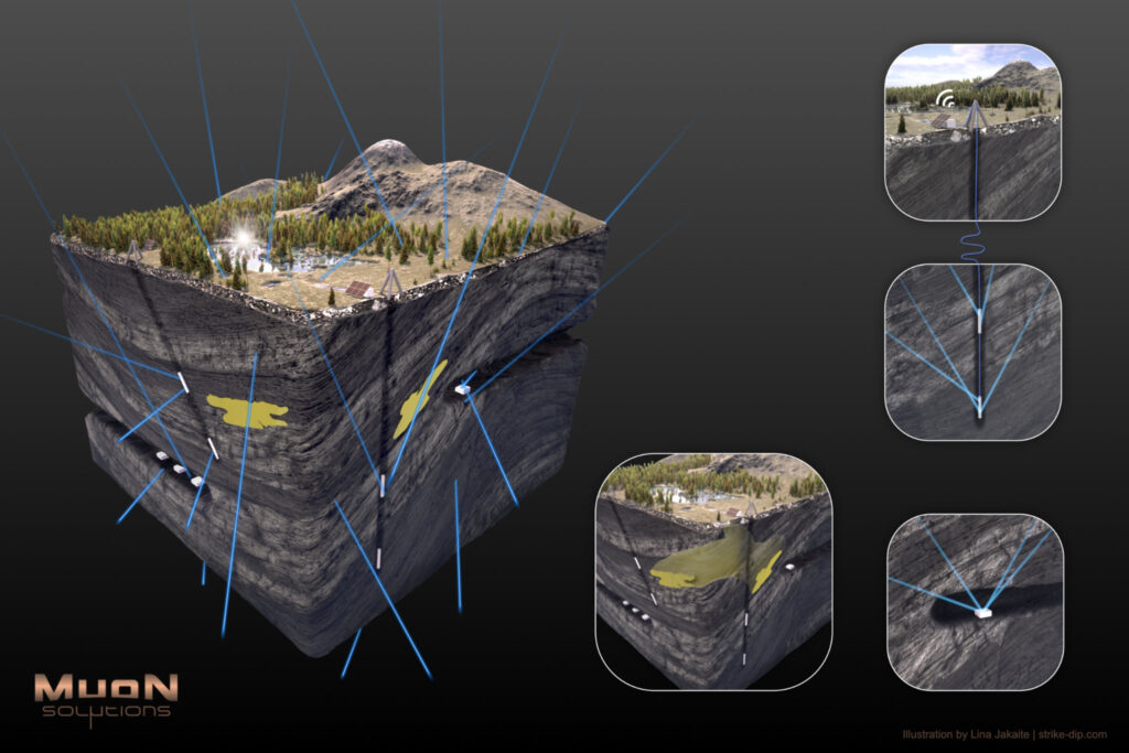
Muography
Illustrations done for company specializing in muon tomography.
Although there are no labels in the first image – it is pretty easy to understand – blue trails are muon trails, white boxes are detectors in the boreholes and underground mines and the yellow body – ore body.
But there are plenty of info online, if you find this method interesting or unknown.
The last two images – just a couple of environment variations.
Tectonic Plates
I was working on the project regarding the rift system, also at the same time earthquakes in Turkey and Syria happened, so somehow naturally I drifted towards tectonics, and tectonic plates and thought that it would be interesting to make the ‘exploded view’ of the tectonic plates. I know there are a lot of them on internet, I just had an idea to make it in my style, with lava-glowing edges. However, while making first drafts and looking on the internet for the details I realized that in many cases, in such ‘exploded view’ illustrations there is a problem that all tectonic boundaries look like either divergent or transform but the subduction, or rather the subducted part of the plate is invisible and, even though there might be marking of the subduction edge it is still difficult to imagine, especially for non-geo person.
So I search for subduction data, found USGS Slab 2.0 data (https://www.usgs.gov/tools/slab20-interactive-map). Nice, clean, open data, articles available, etc., just google for more. And included that slab data into my animation.
The subduction slabs are all in scale, i.e. there is no vertical exaggeration. And what surprised me is how big and deep they are. I am not trying to pretend to be an expert in tectonics, so, yea, it did surprise me, as I, for some reason, had a picture in my head that they are more shallow.
The surface elevations are all flattened to 0, as it is so tiny compared to whole globe that is gives more visual noise to the animation than the actual benefit.
Also, simplified model at the exploded view is available on on sketchfab: https://skfb.ly/oEQTW
I am fully aware that some details regarding the plate boundaries or depths of the certain parts of the slabs might be debatable, or that something is too simplified. But I’ll leave it to experts and as a disclaimer will call this animation a pop-geo-animation even though it is based on actual GIS data and is all in scale :)) Enjoy!
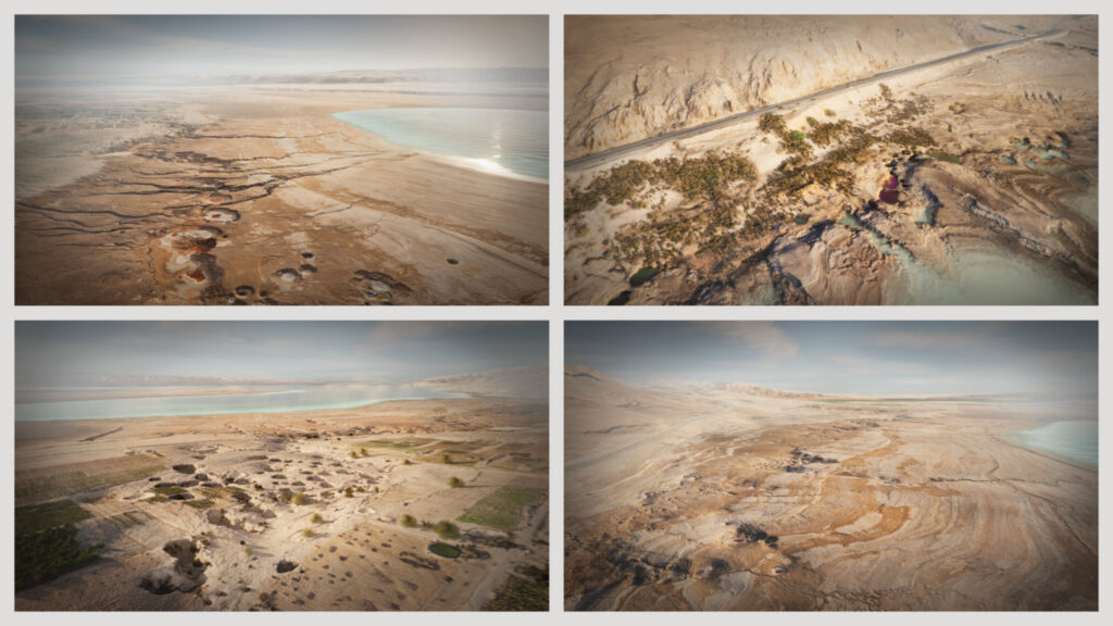
Vision on a UNESCO Global Geopark – Southeastern Dead Sea
Animation was done as part of the initiation of a UNESCO Global Geopark in Jordan – it presents the highlight area of sinkholes and subsidence at the Dead Sea. More info can be found under https://www.mdpi.com/2073-445X/11/4/549 and https://www.mdpi.com/2073-445X/11/4/553 .
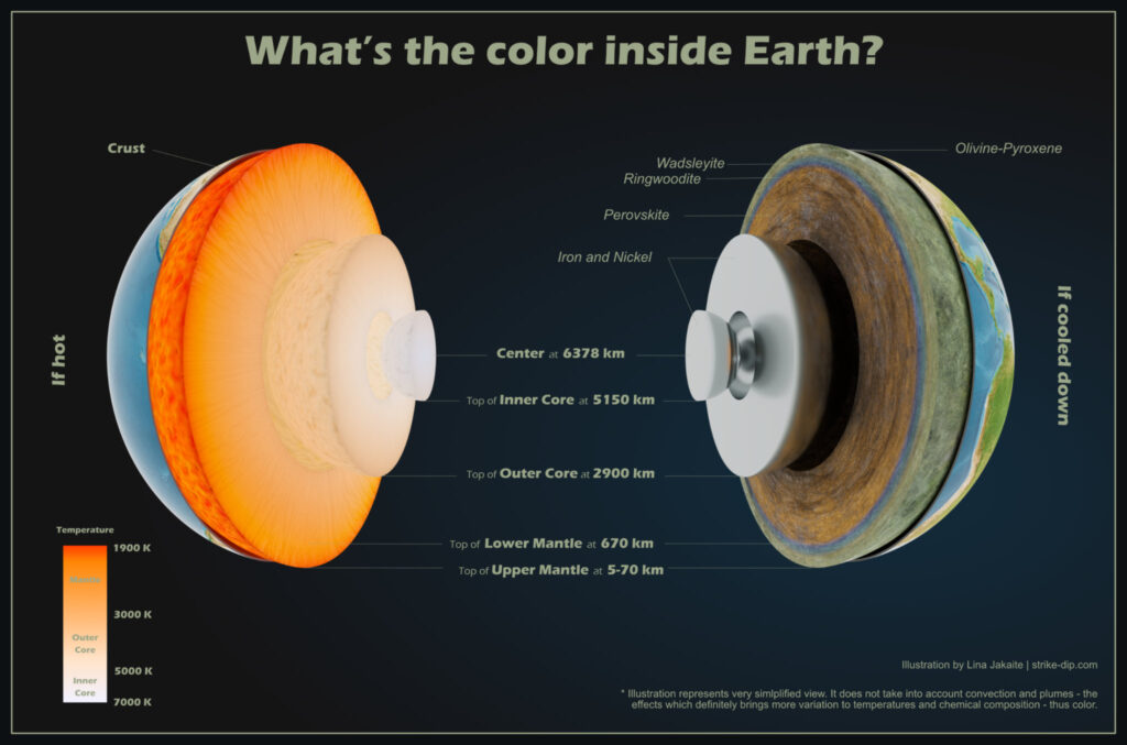
What’s the color inside Earth?
Years ago, probably in my first years of studying geology, when I learned that huge part of Earth’s mantle is olivine-green I was amazed by that fact. And at the same time I found it interesting that most of Earths structure illustrations show red-hot-glowing spheres and there’s no clue about parts of it being green. So the green-mantle illustration idea was born long time ago :)) .
I am fully aware that the internal structure, thus colors are not that obvious and simple. In this illustration there is no representation of convection, plumes or subduction slabs. And the deeper you go the more theory based all is.
It’s just the very basic, most common numbers and facts about the Earths structure illustrated but in slightly different perspective, to raise the curiosity and questions of What and Why??
By the way, interesting thing. I had an idea of showing half of it as hot-red and another part as ‘cooled down’. I was struggling to find the nice balance for these red and yellow colors, how do I show it properly, how do I show one sphere hotter than other, but then again making sure they are all well visible. I was jumping back and forth with those colors, but when I saw Earths internal temperature graph somewhere and because it was in Kelvins somehow ‘connecting the dots’ moment happened and I realized that there is also the color spectrum for black body based on its temperature in Kelvins known. So what I did – I simply used black body color spectrum based on its temperature. So we can say that those hot colors are also true colors :))
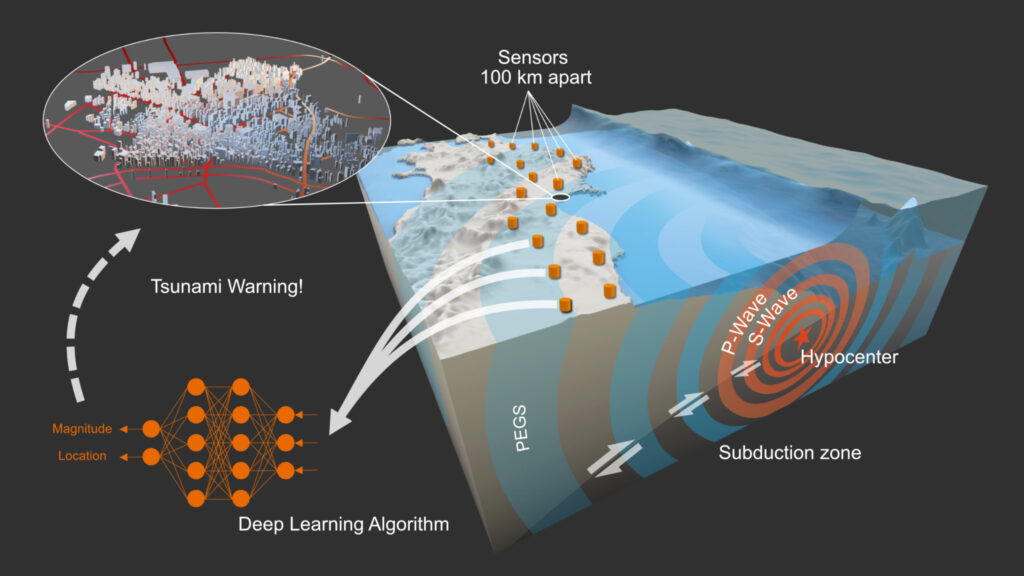
New way to speed up tsunami warning
Illustration for an article: https://www.nature.com/articles/s41586-022-04672-7?fbclid=IwAR04NCffqDrj0G-rijQPRQHh1MXx84IkjmeHP-Too4bUPnh7ATFo9Li6psw
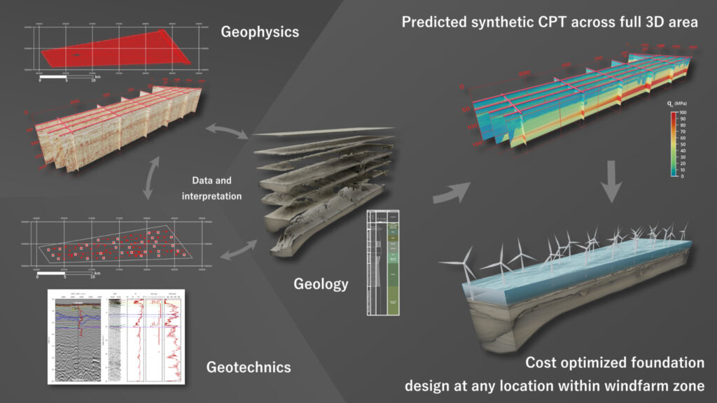
Integrated Ground Model. Ten noorden van de Waddeneilanden Wind Farm Zone
Ten noorden van de Waddeneilanden Wind Farm Zone (TNWWFZ) is located 56 km off the north coast of the Netherlands. NGI and SAND Geophysics have developed an Integrated Ground Model of this area by combining knowledge from Geology, Geophysics and Geotechnical engineering. This model provides geotechnical design parameters for the complete 3D area.
Animation on youtube: https://youtu.be/JEenpiAU8Mk
Vittangi Graphite Project
This animation is focused on the geology of the Vittangi graphite, Northern Sweden. If you’d like to know more on where this graphite could and will be used check another video: https://youtu.be/d3-GRuNGZYI
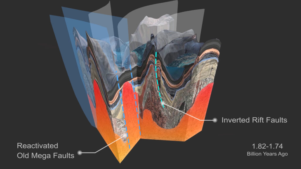
Two Billion Years in the Making – Greater Falun Project
‘Two Billion Years in the Making – Greater Falun Project’ animation shows the geological evolution of Falun (Sweden) area. It explains how different layers formed, what happened when rifting and opposite (compression) were dominant in the area, how the Cu-Au and polymetallic skarns (main targets) formed and why limestone layer present in the area is so helpful in prospecting.
Animation is accompanied with a bunch of illustrations. To see them all check this: https://strike-dip.com/two-billion-years-in-the-making-greater-falun-project/
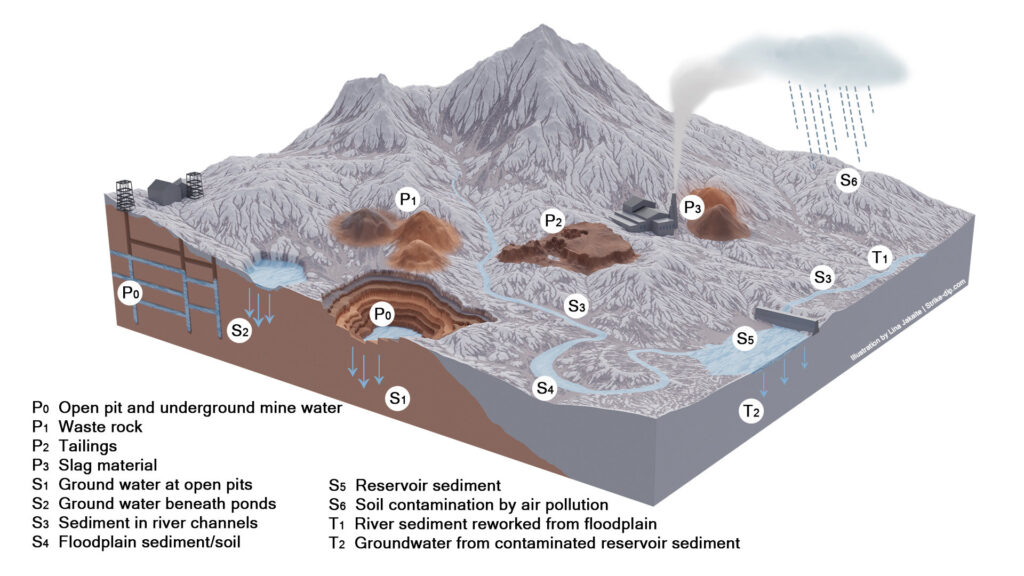
Mine’s pollution pathways
Link to full publication: https://www.wolkersdorfer.info/publication/pdf/Effects%20of%20Mining%20on%20Surface%20Water.pdf
Lake Wells Sulphate of Potash Project
Geological evolution of Lake Wells (West Australia) paleochannel. More about: https://strike-dip.com/lake-wells-sulphate-of-potash-project/
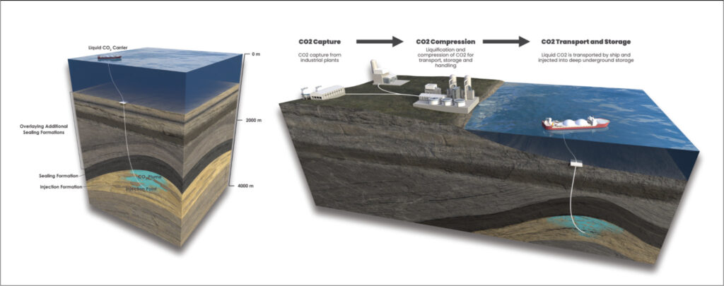
Carbon Capture and Storage
A couple of illustrations done for InCapture. Both illustrations and more info can be found there: https://incapture.com.au/carbon-capture-and-storage/
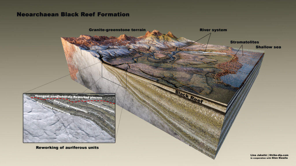
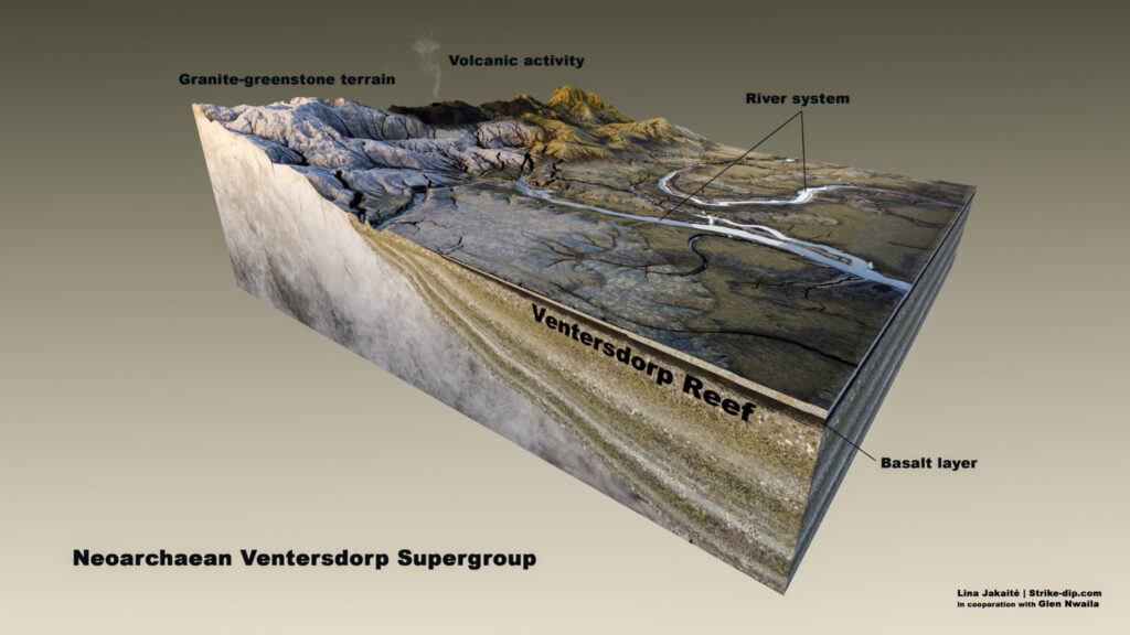
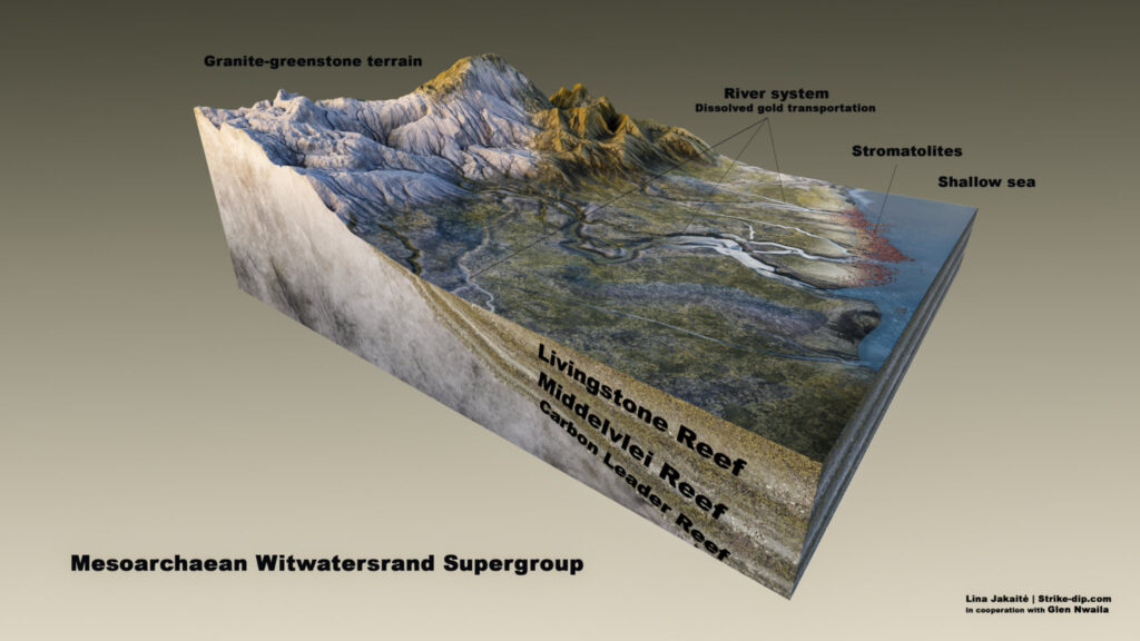
Witwatersrand gold deposition environments illustrated
Illustrations of Mesoarchaean-Neoarchaean environments within which the Witwatersrand-type gold deposits formed. Read more about what they show and what is the study behind them: https://strike-dip.com/witwatersrand/
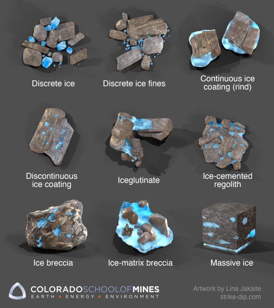
Lunar Ice Textures
If you’re interested to learn more go and check professor Kevin Cannon’s website https://kevincannon.rocks/lunarmining/#textures